银掠武器边框样式
1463
1
2021-06-18
2022-10-12
Hey、小怪兽
前言
- • (代码提供:♦ 有猫的茶水间,代码修改:♦ Hey、小怪兽)
- • 首先,在银河掠夺者里,一个金色武器边框的样式是这样的,如果需要做武器图鉴的话,这种边框样式是少不了的
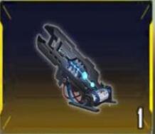
- • 分析后,我们总共需要:
- - 武器的贴图
- - 金色的边框(border)
- - 黄色的左右两边的梯形
- - 四根浅黄色的线在四个角
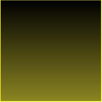
- - 黑到黄的渐变色背景
第一步:画出正方形轮廓
- • 首先在CSS里写正方形轮廓的代码
.ta-weaponModal-img {
    position: relative;
    width: 128px;
    height: 128px;
    border: 1px solid #ffff00;
    margin-left: calc(50% - 64px);
}

.ta-weaponModal-cardbgGold {
    background-image: linear-gradient(#000000, #8b8522);
}
- • HTML代码如下:
<div class="ta-weaponModal-img ta-weaponModal-cardbgGold">

</div>
- • .ta-weaponModal-img是给在HTML里有ta-weaponModal-img这样的class name的标签加上CSS样式
- • position是相对定位,为了方便后面的绝对定位
- • width和height是正方形的长度和宽度
- • border是正方形的边框,边框长度为1px,是solid(实线),#ffff00是颜色(偏金黄)
- • margin-left是正方形向左偏移,calc是计算,计算50%-64px,这表示了水平居中的意思,50%左偏移减去一半的正方形长度刚好是水平居中
- • background-image是正方形的背景图形,linear-gradient是渐变,默认从上到下,颜色是#000000到#8b8522
- 保存一下就可以看到这样的样式了
第二步:画出左右梯形
- • 左右梯形需要2个div做绝对定位,HMTL的代码如下:
<div class="ta-weaponModal-img ta-weaponModal-cardbgGold">
    <div class="ta-weaponpImg-border ta-weaponpImg-left ta-weaponModal-leftGold"></div>
    <div class="ta-weaponpImg-border ta-weaponpImg-right ta-weaponModal-rightGold"></div>
</div>
- • CSS代码如下:
.ta-weaponpImg-border {
    position: absolute;
    top: 50%;
    transform: translateY(-50%);
    height: 67%;
    border: 4px solid transparent;
}

.ta-weaponpImg-left {
    left: 0;
}

.ta-weaponpImg-right {
    right: 0;
}

.ta-weaponModal-leftGold {
    border-left-color: #eeea17;
}

.ta-weaponModal-rightGold {
    border-right-color: #eeea17;
}
- • position是绝对定位,子绝父相,可以定位到任何位置
- • top,定位后调整位置
- • transform中的translateY也是调整位置,和top50%配合可以让梯形垂直居中
- • height就是梯形的长度,height越大,梯形越长(上下的长度)
- • border就是梯形的高度,border越大,梯形越大(左右的长度),transparent就是透明的意思,透明背景
- • left和right为0,分别让两个梯形在左边和在右边
- • border-left-color和border-right-color分别设置了左右梯形的颜色(为何不直接在上面的border里面设置呢?因为如果上面设置了那就变成了金色,如果我们要其他颜色的改的话很麻烦,所以把颜色单独提出来设置)
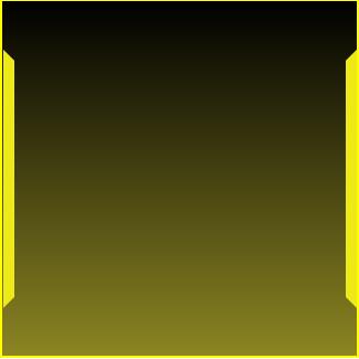
- 保存一下就可以看到这样的样式了
第三步:画四条细线
- • 写细线我们需要用掉伪元素选择器::before和::after,CSS代码如下:
.ta-weaponpImg-left:before,
.ta-weaponpImg-left:after {
    content: '';
    display: inline-block;
    width: 20px;
    height: 0.3px;
    position: absolute;
    left: 0;
    transform-origin: top left;
    transform: rotate(45deg);
}

.ta-weaponpImg-left:before {
    top: -20px;
}

.ta-weaponpImg-left:after {
    bottom: -20px;
    transform: rotate(-45deg);
}

.ta-weaponpImg-right:before,
.ta-weaponpImg-right:after {
    content: '';
    display: inline-block;
    width: 20px;
    height: 0.3px;
    position: absolute;
    right: 0;
    transform-origin: top right;
    transform: rotate(-45deg);
}

.ta-weaponpImg-right:before {
    top: -20px;
}

.ta-weaponpImg-right:after {
    bottom: -20px;
    transform: rotate(45deg);
}

.ta-weaponModal-leftGold:before, .ta-weaponModal-leftGold:after, .ta-weaponModal-rightGold:before, .ta-weaponModal-rightGold:after {
    background: #ffed10;
}
- • ::before和::after是伪元素选择器,表示在这个元素内容前面创建一个行内元素,也可以写:before和:after,一个是CSS2的一个是CSS3的
- • content是固定搭配,必须要添加的
- • display为inline-block设置为行内块元素
- • width控制的是线的长度,width越大,线越长
- • height控制的是线的宽度,height越宽,线越粗
- • position依旧是绝对定位
- • transform-origin指的是元素的旋转基点,因为这个线毕竟是斜着的
- • transform的rotate(45deg);就是旋转45度,deg就是度
- • bottom和top一样,同理left和right,指的是距离上下左右的距离
- • ta-weaponpImg-left:before指的是左上角的线,ta-weaponpImg-right:before指的是右上角的线
- • ta-weaponpImg-left:after和ta-weaponpImg-right:after分别是左下角和右下角的线,单独拎出来写样式,因为线斜的角度不同
- • background为#ffed10是线的颜色
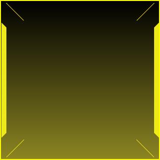
- 保存一下就看到了,可以自行调整线更美观
最后一步:放上图片
- • 在CSS里添加:
.ta-weaponModal-img img {
    width: 100%;
}
- • 在HTML里添加,加在div的classname为ta-weaponModal-img里面
<img src="/武器.png" alt="">
- • ta-weaponModal-img img表示,这个名字的元素下面的img元素加入CSS属性
- • width为100%就是保证自己的宽度为父元素的宽度

- 保存一下就完成了
附加:添加其他颜色
- • 因为我们的武器图鉴不止金色武器,还有紫色,蓝色,绿色,白色,所以这个时候在前面单独拎出颜色写样式就起到作用了
- • 只需要在CSS里添加就可以了:
.ta-weaponCard-gold { border: 1px solid #ffff00; }
.ta-weaponText-gold { color: #d4d400; }
.ta-weaponCard-purple { border: 1px solid #d600d6; }
.ta-weaponText-purple { color: #980398; }
.ta-weaponCard-blue { border: 1px solid #00b1ff; }
.ta-weaponText-blue { color: #2fb6de; }
.ta-weaponCard-green { border: 1px solid #11e911; }
.ta-weaponText-green { color: #14b714; }
.ta-weaponCard-white { border: 1px solid #999999; }
.ta-weaponText-white { color: #7d7d7d; }

.ta-weaponModal-cardbgGold { background-image: linear-gradient(#000000, #8b8522); }
.ta-weaponModal-cardbgPurple { background-image: linear-gradient(#000000, #613793); }
.ta-weaponModal-cardbgBlue { background-image: linear-gradient(#000000, #22678b); }
.ta-weaponModal-cardbgGreen { background-image: linear-gradient(#000000, #169011); }
.ta-weaponModal-cardbgWhite { background-image: linear-gradient(#000000, #828482); }

.ta-weaponModal-leftGold { border-left-color: #eeea17; }
.ta-weaponModal-leftPurple { border-left-color: #b858d9; }
.ta-weaponModal-leftBlue { border-left-color: #23b6ff; }
.ta-weaponModal-leftGreen { border-left-color: #4cef30; }
.ta-weaponModal-leftWhite { border-left-color: #b9b9b9; }

.ta-weaponModal-rightGold { border-right-color: #eeea17; }
.ta-weaponModal-rightPurple { border-right-color: #b858d9; }
.ta-weaponModal-rightBlue { border-right-color: #23b6ff; }
.ta-weaponModal-rightGreen { border-right-color: #4cef30; }
.ta-weaponModal-rightWhite { border-right-color: #b9b9b9; }

.ta-weaponModal-leftGold:before, .ta-weaponModal-leftGold:after,
.ta-weaponModal-rightGold:before, .ta-weaponModal-rightGold:after {
    background: #ffed10;
}

.ta-weaponModal-leftPurple:before, .ta-weaponModal-leftPurple:after,
.ta-weaponModal-rightPurple:before, .ta-weaponModal-rightPurple:after {
    background: #9b1fab;
}

.ta-weaponModal-leftBlue:before, .ta-weaponModal-leftBlue:after,
.ta-weaponModal-rightBlue:before, .ta-weaponModal-rightBlue:after {
    background: #207eaa;
}

.ta-weaponModal-leftGreen:before, .ta-weaponModal-leftGreen:after,
.ta-weaponModal-rightGreen:before, .ta-weaponModal-rightGreen:after {
    background: #18a52f;
}

.ta-weaponModal-leftWhite:before, .ta-weaponModal-leftWhite:after,
.ta-weaponModal-rightWhite:before, .ta-weaponModal-rightWhite:after {
    background: #9a9c9a;
}
- • 之后需要什么样式,直接修改classname就可以了
完整代码
- • HTML
<div class="ta-weaponModal-img ta-weaponModal-cardbgGold">
    <div class="ta-weaponpImg-border ta-weaponpImg-left ta-weaponModal-leftGold"></div>
    <div class="ta-weaponpImg-border ta-weaponpImg-right ta-weaponModal-rightGold"></div>
    <img src="/武器.png" alt="">
</div>
- • CSS
.ta-weaponModal-img {
    position: relative;
    width: 128px;
    height: 128px;
    border: 1px solid #ffff00;
    margin-left: calc(50% - 64px);
}

.ta-weaponModal-cardbgGold {
    background-image: linear-gradient(#000000, #8b8522);
}

.ta-weaponpImg-border {
    position: absolute;
    top: 50%;
    transform: translateY(-50%);
    height: 67%;
    border: 4px solid transparent;
}

.ta-weaponpImg-left {
    left: 0;
}

.ta-weaponpImg-right {
    right: 0;
}

.ta-weaponModal-leftGold {
    border-left-color: #eeea17;
}

.ta-weaponModal-rightGold {
    border-right-color: #eeea17;
}

.ta-weaponpImg-left:before,
.ta-weaponpImg-left:after {
    content: '';
    display: inline-block;
    width: 20px;
    height: 0.3px;
    position: absolute;
    left: 0;
    transform-origin: top left;
    transform: rotate(45deg);
}

.ta-weaponpImg-left:before {
    top: -20px;
}

.ta-weaponpImg-left:after {
    bottom: -20px;
    transform: rotate(-45deg);
}

.ta-weaponpImg-right:before,
.ta-weaponpImg-right:after {
    content: '';
    display: inline-block;
    width: 20px;
    height: 0.3px;
    position: absolute;
    right: 0;
    transform-origin: top right;
    transform: rotate(-45deg);
}

.ta-weaponpImg-right:before {
    top: -20px;
}

.ta-weaponpImg-right:after {
    bottom: -20px;
    transform: rotate(45deg);
}

.ta-weaponModal-leftGold:before,
.ta-weaponModal-leftGold:after,
.ta-weaponModal-rightGold:before,
.ta-weaponModal-rightGold:after {
    background: #ffed10;
}

.ta-weaponModal-img img {
    width: 100%;
}
- • 修改样式只需要修改HMTL的Gold为其他颜色,Purple,Blue...