Echarts多列柱状图重叠
1656
0
2022-08-27
2023-07-26
Hey、小怪兽
- • 版本:React 16.8.6,Echarts 5.3.2
- • 需求如下,产品又不知道用哪里看来的(为什么是鸡,公司的需求做了点修改):
- • 可以看到一个鸡窝会有一只鸡王和好几只母鸡,这个表难就难在鸡窝123的鸡都是不同的
- • 首先先弄成一个组件,先建好文件引入,id是要初始化Echarts用的,title就是标题:
-
import { ChickenChart } from './echarts/chickenChart'; /* 省略代码 */ <ChickenChart id="chickenChart" title="鸡窝生崽率"></ChickenChart> - • 去Echarts官网看看有没有合适的图表可以改改的,有个差不多的:

- • 简单改了一下:
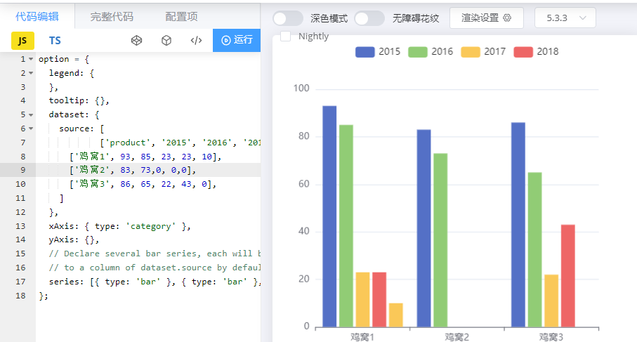
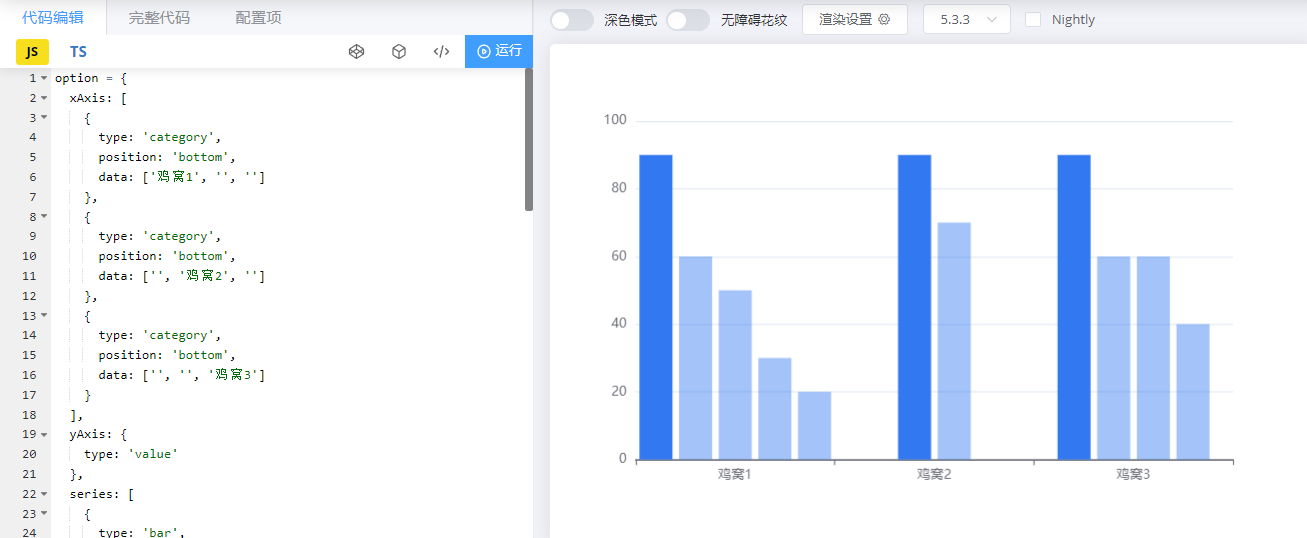
- • 看起来挺像的但是还是有一小点不一样,因为上面说了,每个鸡窝的鸡都不是固定的
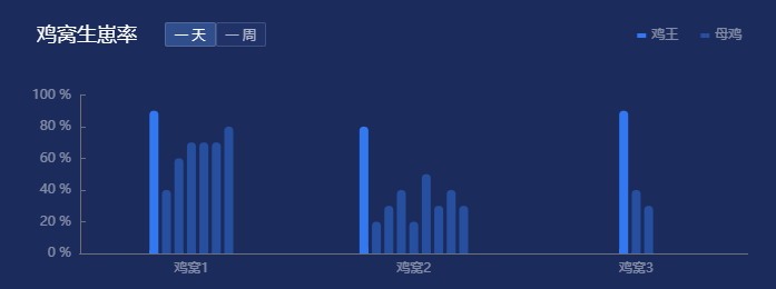
- • 这样的图表一看就知道,每个鸡窝有5只鸡,只是鸡窝2少了3只,所以希望鸡窝2只有2只的时候,数据为0的时候不会占位置,也就是柱状图的柱体要居中
- • 我看了Echarts的文档好久没找到方法,只好用偏方了,那就是多列柱状图重叠(好孩子不要学),看,是不是有点鸡窝的感觉了,和上图的区别就在于空的柱状图没有占位置:
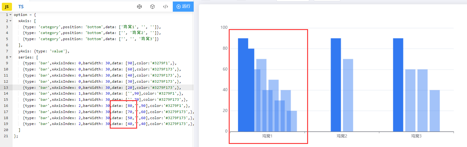
- • 可以把下面的代码放到Echarts官网代码编辑里去自己试试:
-
option = { xAxis: [ {type: 'category',position: 'bottom',data: ['鸡窝1', '', '']}, {type: 'category',position: 'bottom',data: ['', '鸡窝2', '']}, {type: 'category',position: 'bottom',data: ['', '', '鸡窝3']} ], yAxis: {type: 'value'}, series: [ {type: 'bar',xAxisIndex: 0,barWidth: 30,data: [90],color:'#3279F1',}, {type: 'bar',xAxisIndex: 0,barWidth: 30,data: [60],color:'#3279F173',}, {type: 'bar',xAxisIndex: 0,barWidth: 30,data: [40],color:'#3279F173',}, {type: 'bar',xAxisIndex: 0,barWidth: 30,data: [30],color:'#3279F173',}, {type: 'bar',xAxisIndex: 0,barWidth: 30,data: [20],color:'#3279F173',}, {type: 'bar',xAxisIndex: 1,barWidth: 30,data: ['',90],color:'#3279F1',}, {type: 'bar',xAxisIndex: 1,barWidth: 30,data: ['',70],color:'#3279F173',}, {type: 'bar',xAxisIndex: 2,barWidth: 30,data: ['','',90],color:'#3279F1',}, {type: 'bar',xAxisIndex: 2,barWidth: 30,data: ['','',60],color:'#3279F173',}, {type: 'bar',xAxisIndex: 2,barWidth: 30,data: ['','',60],color:'#3279F173',}, {type: 'bar',xAxisIndex: 2,barWidth: 30,data: ['','',40],color:'#3279F173',}, ] }; - • 注意几点:
- - xAxis的position: 'bottom'必须要写,不写的话,坐标轴会飞到上面去
- - series的xAxisIndex必须要写,这个是根据你所在的x轴写的,因为有3个x轴,所以写012,如果4个x轴就写0123
- - xAxis里data的格式和series里data的格式都是有规律的
• 先不写了,我同事喊我去吃生蚝自助,下周在写吧- • 至于series的data为啥是[a],['',a],['','',a],就是柱状图重叠,可以随便在['','',a]的数据里改点,就重叠了,只不过是设置为空让柱状图只使用[a]的数据
- • 最难的实现了剩下的都是简单的,比如纵坐标改成百分比:
-
yAxis: { type: 'value', axisTick: { show: true, inside: true, }, axisLine: { show: true, }, splitLine: { show: false, }, axisLabel: { color: 'rgba(255,255,255,0.45)', // 在这里改成百分比 formatter: '{value} %', }, // 注意这里必须要写100,因为100%是最大的,如果要200%改成200,不然柱状图会不准 max: 100, }, - • 为了让图表能够动态添加数据,需要把xAxis和series提取成变量,上文也说了,它们是有规律的,根据规律先导出两个需要用到的方法:
-
/** * Echarts方法,只在特定的时候需要 * 输入value, num, length * 先根据length判断 * length = 1 [''] * length = 2 ['', ''] * length = 3 ['', '', ''] * 再根据value和num * length = 3 value = 123 num = 0 [123, '', ''] * length = 3 value = 123 num = 1 ['', 123, ''] * length = 3 value = 123 num = 2 ['', '', 123] */ export function getMiddleSpaceArray(v, n, l) { let arr = []; for (let i = 0; i < l; i++) { arr.push(''); } arr[n] = v; return arr; } -
/** * Echarts方法,只在特定的时候需要 * 输入value, num * value = 123 num = 0 [123] * value = 123 num = 1 ['', 123] * value = 123 num = 2 ['', '', 123] * value = 123 num = 3 ['', '', '', 123] */ export function getHeaderSpaceArray(v, n) { let arr = []; for (let i = 0; i < n; i++) { arr.push(''); } arr.push(v); return arr; } - • 在Echarts文件导入后就可以使用了:
-
import { getHeaderSpaceArray, getMiddleSpaceArray } from '../../styles/echarts/utils'; - • 这个数据是外面传进来的,模拟数据:
-
xLabel: ['鸡窝1', '鸡窝2', '鸡窝3'], xData: [ [90, 40, 60, 70, 70, 70, 80], [80, 20, 30, 40, 20, 50, 30, 40, 30], [90, 40, 30], ], - • 定义好xAxis和series,就可以知道length(要传给方法的)
-
let xAxis = []; let series = []; const length = xLabel.length; - • xAxis就可以动态写成一个forEach:
-
xLabel.forEach((value, index) => { xAxis.push({ type: 'category', position: 'bottom', data: getMiddleSpaceArray(value, index, length), axisTick: { show: false, }, axisLabel: { interval: 0, color: ' rgba(255,255,255,0.45)', }, }); }); - • series也可以:
-
xData.forEach((v, i) => { v.forEach((_v, _i) => { series.push({ // 根据下标判断是鸡王还是母鸡 name: _i === 0 ? '鸡王' : '母鸡', type: 'bar', // 我是写成 2 1 0这样的xAxisIndex xAxisIndex: xLabel.length - i - 1, barWidth: 8, data: getHeaderSpaceArray(_v, i), // 柱状图距离,可以改改看效果 barGap: '40%', itemStyle: { // 根据下标判断判断颜色,因为鸡王和母鸡颜色不同 color: _i === 0 ? '#3279F1' : '#3279F173', // 这个是让柱状图柱体头部变成半圆,改了左上和右上的radius,8是根据barWidth borderRadius: [8, 8, 0, 0], }, }); }); }); - • 最后处理的是一天一周的按钮切换,先把样式写好:

-
&-card {
  border: 0;
  background: #1b2b5c;
  &-buttonRow {
    position: absolute;
    top: 27px;
    left: 135px;
    z-index: 999;
    Button {
      font-size: 12px;
      height: 22px;
      color: rgba(255, 255, 255, 0.65);
      margin: 0;
      padding: 0 8px;
      border: 1px solid rgba(255, 255, 255, 0.15);
      background-color: #203268;
      &:hover,
      &:focus {
        color: #ffffff;
        background-color: #314e8c;
      }
    }
    .selectChart {
      color: #ffffff !important;
      background-color: #314e8c !important;
    }
  }
}
import styles from '../styles/homepage/index.less'; - • 导入hook
-
import React, { useState } from 'react'; - • 定义一个切换的变量:
-
// 鸡窝变量,当chickenSelect为day的时候按钮标签选择一天,反之选择一周 const [chickenSelect, setChickenSelect] = useState('day'); - • 定义鸡窝图表的数据:
-
const [chickenData, setChickenData] = useState({ xLabel: ['鸡窝1', '鸡窝2', '鸡窝3'], xData: [ [90, 40, 60, 70, 70, 70, 80], [80, 20, 30, 40, 20, 50, 30, 40, 30], [90, 40, 30], ], }); - • 写好标签:
-
<Card className={styles['home-row-card']} bodyStyle={{ padding: 0, height: 280 }}> <div className={styles['home-row-card-buttonRow']} style={{ marginLeft: '20px' }}> <!-- 如果鸡窝切换chickenSelect为day,就加上选择样式selectChart --> <Button className={chickenSelect === 'day' ? styles['selectChart'] : ''} onClick={() => changeChickenChart('day')} > 一天 </Button> <!-- 如果鸡窝切换chickenSelect为week,就加上选择样式selectChart --> <Button className={chickenSelect === 'week' ? styles['selectChart'] : ''} onClick={() => changeChickenChart('week')} > 一周 </Button> </div> <ChickenChart id="chicken" title="鸡窝生崽率" xLabel={xLabel} xData={xData}></ChickenChart> </Card> - • changeChickenChart就是切换图表的方法:
-
const changeChickenChart = (value) => { // 改变切换的值 setChickenSelect(value); // 改变图表数据 if (value === 'day') { setChickenData({ xLabel: ['鸡窝1', '鸡窝2', '鸡窝3'], xData: [ [90, 40, 60, 70, 70, 70, 80], [80, 20, 30, 40, 20, 50, 30, 40, 30], [90, 40, 30], ], }); } else (value === 'week') { setChickenData({ xLabel: ['鸡窝1', '鸡窝2', '鸡窝3', '鸡窝4'], xData: [ [80, 50, 50, 40, 30, 10, 60, 20, 10, 70], [90, 10, 40, 50, 30, 40, 30, 10, 60, 70], [70, 60, 30, 40, 30, 20, 60, 70, 70, 80], [90, 40, 30], ], }); } }; - • 这样就ok了,贴上完整代码(只能做个参考,我也不大用hook写Echarts,后面有个大佬把我的Echarts用懒加载改了一些):
-
// Less代码 &-card { border: 0; background: #1b2b5c; &-buttonRow { position: absolute; top: 27px; left: 135px; z-index: 999; Button { font-size: 12px; height: 22px; color: rgba(255, 255, 255, 0.65); margin: 0; padding: 0 8px; border: 1px solid rgba(255, 255, 255, 0.15); background-color: #203268; &:hover, &:focus { color: #ffffff; background-color: #314e8c; } } .selectChart { color: #ffffff !important; background-color: #314e8c !important; } } } -
// homepage 外部的代码 import React, { useState } from 'react'; import styles from '../styles/homepage/index.less'; import { Card, Row, Col, Button} from 'antd'; import { ChickenChart } from './echarts/chickenChart'; /* 省略代码其他图表啥的 */ // 看到如果把xAxis和series改成变量就可以加好几个鸡窝了 // 鸡窝变量,当chickenSelect为day的时候按钮标签选择一天,反之选择一周 const [chickenSelect, setChickenSelect] = useState('day'); // 定义鸡窝图表的数据 const [chickenData, setChickenData] = useState({ xLabel: ['鸡窝1', '鸡窝2', '鸡窝3'], xData: [ [90, 40, 60, 70, 70, 70, 80], [80, 20, 30, 40, 20, 50, 30, 40, 30], [90, 40, 30], ], }); // changeChickenChart就是切换图表的方法 const changeChickenChart = (value) => { // 改变切换的值 setChickenSelect(value); // 改变图表数据 if (value === 'day') { setChickenData({ xLabel: ['鸡窝1', '鸡窝2', '鸡窝3'], xData: [ [90, 40, 60, 70, 70, 70, 80], [80, 20, 30, 40, 20, 50, 30, 40, 30], [90, 40, 30], ], }); } else (value === 'week') { setChickenData({ xLabel: ['鸡窝1', '鸡窝2', '鸡窝3', '鸡窝4'], xData: [ [80, 50, 50, 40, 30, 10, 60, 20, 10, 70], [90, 10, 40, 50, 30, 40, 30, 10, 60, 70], [70, 60, 30, 40, 30, 20, 60, 70, 70, 80], [90, 40, 30], ], }); } }; /* 省略代码 export default function (props)啥的 */ <Card className={styles['home-row-card']} bodyStyle={{ padding: 0, height: 280 }}> <div className={styles['home-row-card-buttonRow']} style={{ marginLeft: '20px' }}> <!-- 如果鸡窝切换chickenSelect为day,就加上选择样式selectChart --> <Button className={chickenSelect === 'day' ? styles['selectChart'] : ''} onClick={() => changeChickenChart('day')} > 一天 </Button> <!-- 如果鸡窝切换chickenSelect为week,就加上选择样式selectChart --> <Button className={chickenSelect === 'week' ? styles['selectChart'] : ''} onClick={() => changeChickenChart('week')} > 一周 </Button> </div> <ChickenChart id="chicken" title="鸡窝生崽率" xLabel={xLabel} xData={xData}></ChickenChart> </Card> -
// style文件 // 标题的样式 export const titleStyles = { top: '25px', left: '35px', textStyle: { color: '#FFFFFF', fontSize: 18, fontWeight: 'normal', }, }; // legend的样式 export const legendStyles = { show: true, // 将legend的图形改成有有圆弧的长方形 icon: 'roundRect', // icon的大小 itemWidth: 8, itemHeight: 4, // 图例每项之间的间隔 itemGap: 20, // 文本的样式 textStyle: { color: 'rgba(255, 255, 255, 0.45)', fontSize: 12, }, }; -
// 方法文件 /** * Echarts方法,只在特定的时候需要 * 输入value, num, length * 先根据length判断 * length = 1 [''] * length = 2 ['', ''] * length = 3 ['', '', ''] * 再根据value和num * length = 3 value = 123 num = 0 [123, '', ''] * length = 3 value = 123 num = 1 ['', 123, ''] * length = 3 value = 123 num = 2 ['', '', 123] */ export function getMiddleSpaceArray(v, n, l) { let arr = []; for (let i = 0; i < l; i++) { arr.push(''); } arr[n] = v; return arr; } /** * Echarts方法,只在特定的时候需要 * 输入value, num * value = 123 num = 0 [123] * value = 123 num = 1 ['', 123] * value = 123 num = 2 ['', '', 123] * value = 123 num = 3 ['', '', '', 123] */ export function getHeaderSpaceArray(v, n) { let arr = []; for (let i = 0; i < n; i++) { arr.push(''); } arr.push(v); return arr; } -
// Echarts文件

import React from 'react';
import { useEffect } from 'react';
import * as echarts from 'echarts';
import { titleStyles, legendStyles } from '../../styles/echarts/styles';
import { getHeaderSpaceArray, getMiddleSpaceArray } from '../../styles/echarts/utils';

// 必须在这里申明,不然会重复渲染dom
let myChart = null;

export default function (props) {
  /*
    必须传的值
      xLabel    x轴坐标    Array
      xData     数据       Array
  */
  // 数据处理
  let xAxis = [];
  let series = [];
  let { xLabel, xData } = props;
  // 用于getMiddleSpaceArray方法
  const length = xLabel.length;

  xLabel.forEach((value, index) => {
    xAxis.push({
      type: 'category',
      // 必须要有,不然多柱状图的坐标会在上面
      position: 'bottom',
      data: getMiddleSpaceArray(value, index, length),
      axisTick: {
        show: false,
      },
      axisLabel: {
        interval: 0,
        color: ' rgba(255,255,255,0.45)',
      },
    });
  });

  xData.forEach((v, i) => {
    v.forEach((_v, _i) => {
      series.push({
        // 根据下标判断是鸡王还是母鸡
        name: _i === 0 ? '鸡王' : '母鸡',
        type: 'bar',
        // 我是写成 2 1 0这样的xAxisIndex
        xAxisIndex: xLabel.length - i - 1,
        barWidth: 8,
        data: getHeaderSpaceArray(_v, i),
        // 柱状图距离,可以改改看效果
        barGap: '40%',
        itemStyle: {
          // 根据下标判断判断颜色,因为鸡王和母鸡颜色不同
          color: _i === 0 ? '#3279F1' : '#3279F173',
          // 这个是让柱状图柱体头部变成半圆,改了左上和右上的radius,8是根据barWidth
          borderRadius: [8, 8, 0, 0],
        },
      });
    });
  });

  useEffect(() => {
    const echartsOption = {
      title: {
        // 外面home传的title
        text: props.title,
        ...titleStyles,
      },
      legend: {
        ...legendStyles,
        top: 28,
        right: '5%',
        // 不让选择legend
        selectedMode: false,
      },
      grid: {
        top: '33%',
        left: '5%',
        right: '5%',
        bottom: '-15px',
        containLabel: true,
      },
      xAxis: xAxis,
      yAxis: {
        type: 'value',
        axisTick: {
          show: true,
          inside: true,
        },
        axisLine: {
          show: true,
        },
        splitLine: {
          show: false,
        },
        axisLabel: {
          color: 'rgba(255,255,255,0.45)',
          // 在这里改成百分比
          formatter: '{value} %',
        },
        // 注意这里必须要写100,因为100%是最大的,如果要200%改成200,不然柱状图会不准
        max: 100,
      },
      series: series,
    };
    // 判断Echarts是否初始化,如果初始化了就销毁
    if (myChart !== null && myChart !== '' && myChart !== undefined) {
      myChart.dispose(); //销毁
    }
    // 初始化
    myChart = echarts.init(document.getElementById(props.id));
    myChart.setOption(echartsOption);
    // 加上这段代码,在拉伸浏览器的宽度的时候,图表也会重新绘制
    window.addEventListener('resize', function () {
      myChart.resize();
    });
  }, [props]);

  return (
    <React.Fragment>
      <div id={props.id} style={{ width: '100%', height: '100%' }} />
    </React.Fragment>
  );
}